


Skip to content
Ronan Dela Cruz
Back to projects

Personal · Interactive UI component collection

React Component Showcase

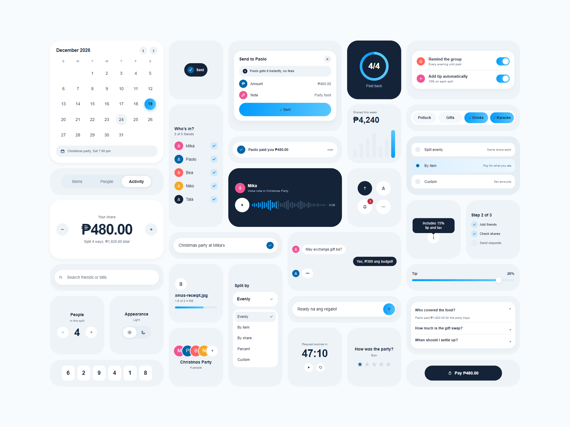
React Component Showcase with 31 blue-themed interface cards, including a calendar, payment panel, spending chart, chat, sliders, and verification inputs.

Image 1 of 1

Open full-size image (opens in a new tab)

Overview

A collection of 31 reusable React components I built to explore interface design, motion, and interaction. An expense-sharing scenario brings calendars, payment controls, chat previews, charts, and forms together on one interactive board. Visitors can watch a coordinated replay or take control of the components themselves.

A frontend showcase with simulated payments, receipt uploads, voice-note progress, chat, and verification states. These interactions run in browser memory; the project does not connect to payment, messaging, upload, or authentication services.

My contribution

Frontend Developer

I built the React components, shared UI primitives, CSS styling, and demo state management. My work covered the board layout, animated transitions, keyboard interactions, configurable scenario data, and the handoff from automatic replay to manual interaction.

Component collection

  • Expense components include a payment panel, transfer status, paid-progress ring, spending bars, category selectors, split options, share controls, receipt progress, and payment notifications.
  • Social and planning components include a navigable event calendar, attendee selection, chat bubbles, message composer, search, voice-note preview, group avatars, event-name field, and FAQ accordion.
  • Additional controls include segmented buttons, shortcuts, checklists, percentage sliders, people counters, appearance selection, countdown timers, star ratings, and a multi-field verification-code input.

Replay & interaction

  • A coordinated 12-second replay changes dates, amounts, selections, messages, and progress states, then folds and reveals cards for the next cycle.
  • Pointer interaction with a control or keyboard focus stops the replay so visitors can explore the board. Escape restarts it when reduced motion is not enabled; ?autoplay=0 starts with a still board.
  • Manual interactions update local React state, including attendee selection, amount adjustments, search-result counts, message composition, and simulated payment and upload progress.

Visual design & motion

  • A blue theme combines rounded cards, inset surfaces, gradients, and shared SVG icons. CSS custom properties control the palette, while CSS Grid defines the board composition.
  • ResizeObserver scales the fixed 960-by-720 board to fit the available viewport while preserving its composition.
  • CSS transitions and the Web Animations API animate state changes and changing amount digits. The demo observes the system reduced-motion preference and disables automatic replay when requested.

Reusable architecture & keyboard support

  • Components receive data and event handlers through props. Shared Card, Icon, Dot, RoundButton, and ProgressTrack primitives keep recurring interface elements consistent.
  • Scenario content and replay cues live in separate modules, so names, amounts, events, and animation timing can be changed independently of the card implementations. Cards can be imported into another React interface with the shared stylesheet.
  • Controls include accessible names, visible keyboard focus, pressed and expanded states, and inactive-panel focus prevention. Verification inputs support numeric paste, focus advancement, backspace navigation, and focus transfer after completion.